
Identity · Campaign · Guidelines
ASTP
ASTP is a nonprofit organisation with headquarters in The Netherlands. ASTP are committed to promoting and facilitating knowledge transfer between universities and industry partners through a range of conferences, support network and a learning platform. Since being established in 2000, ASTP now supports more than 800 members in over 40 countries.
ASTP’s focal point has been on providing outstanding training and practice exchange among Knowledge Transfer professionals.
Following a corporate merger, we were approached with a need to refocus the new organisation while bringing back the feeling of ownership to the stakeholders.
-
Approach
We started the project with a series of discovery sessions. We dissected the ASTP brand, company, mission and values. We interviewed key stakeholders and diagnosed pain-points of the existing brand.
Through the strategy we concluded the following brand pillars resonated most with ASTP:
— To foster community networks
— To inspire knowledge transfer
Following the brand strategy phase, we developed concepts around visual metaphors of networks and transfer.
-
Solution
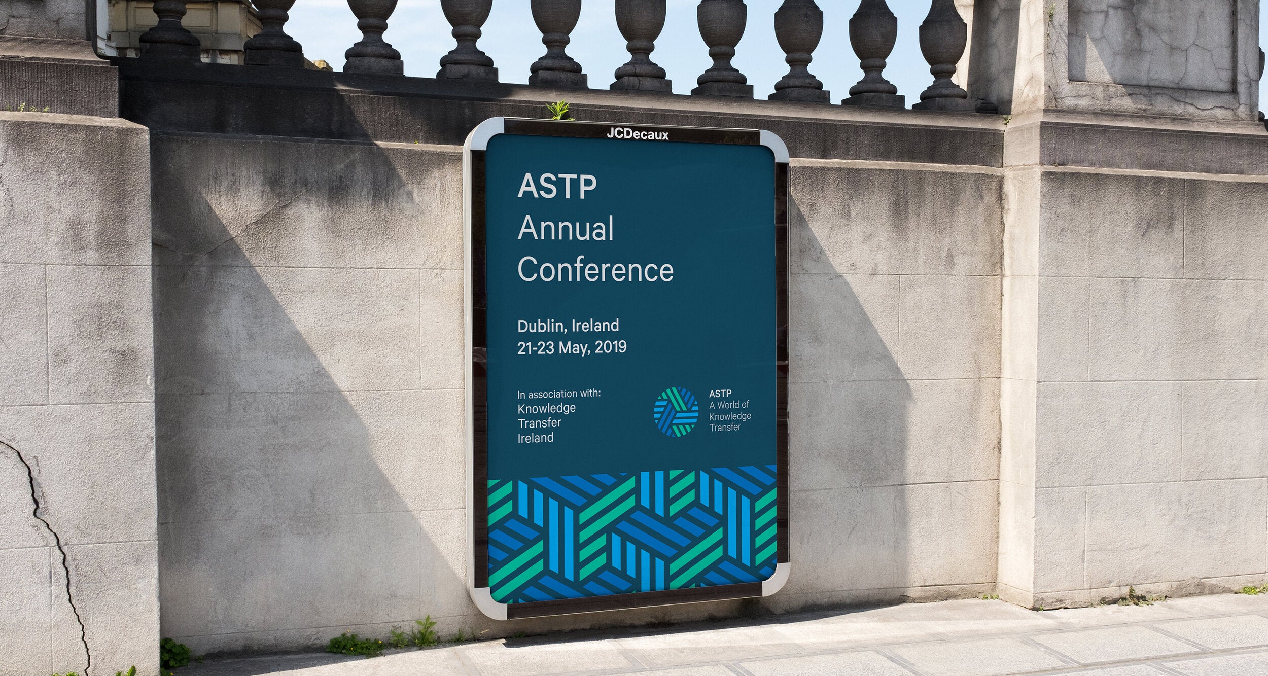
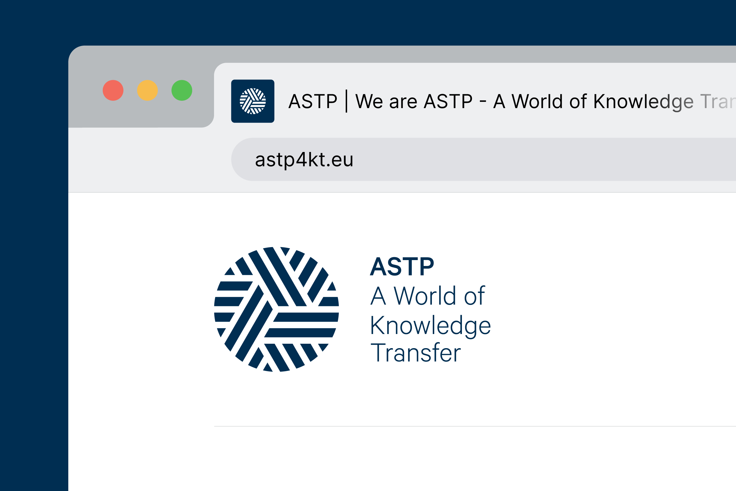
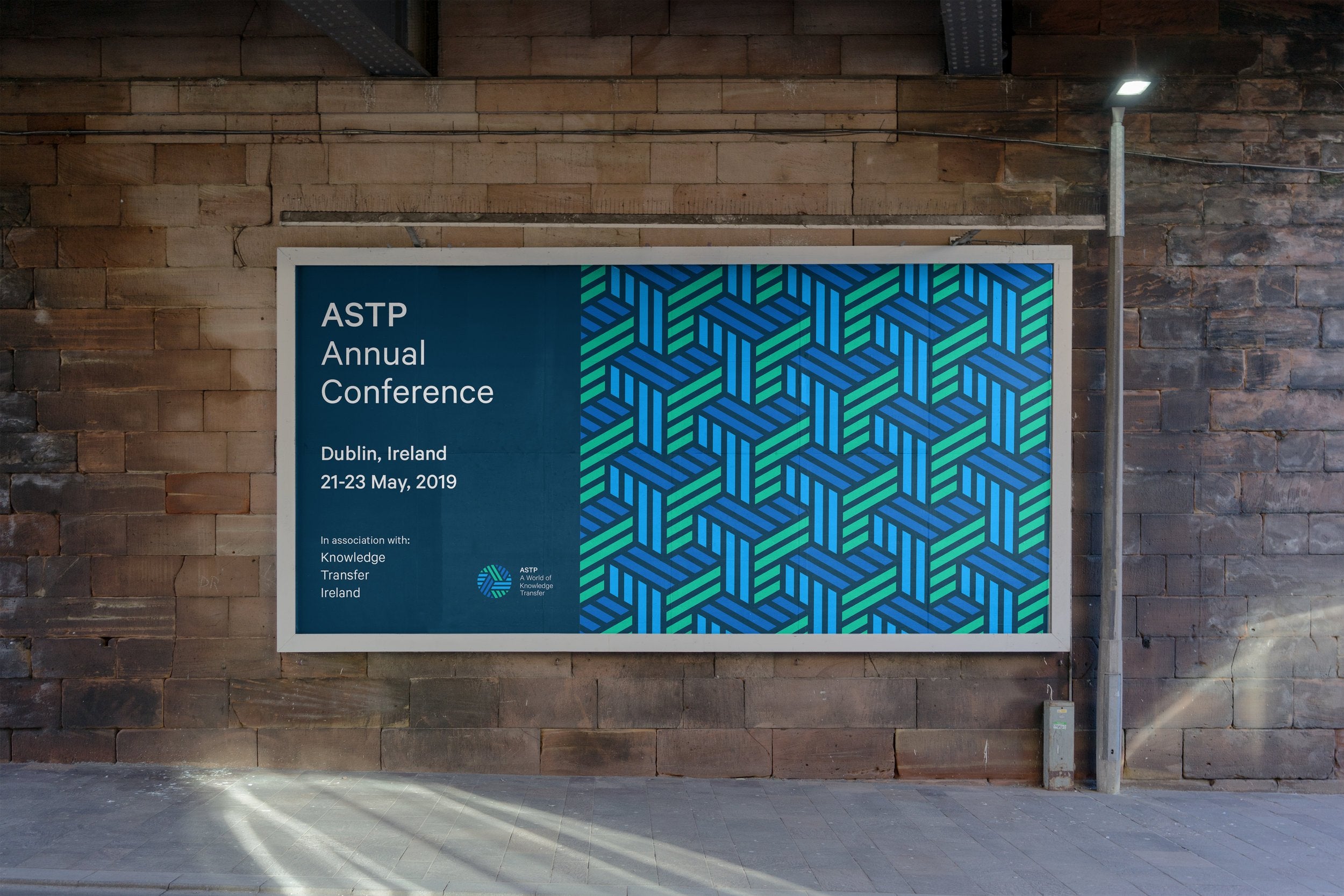
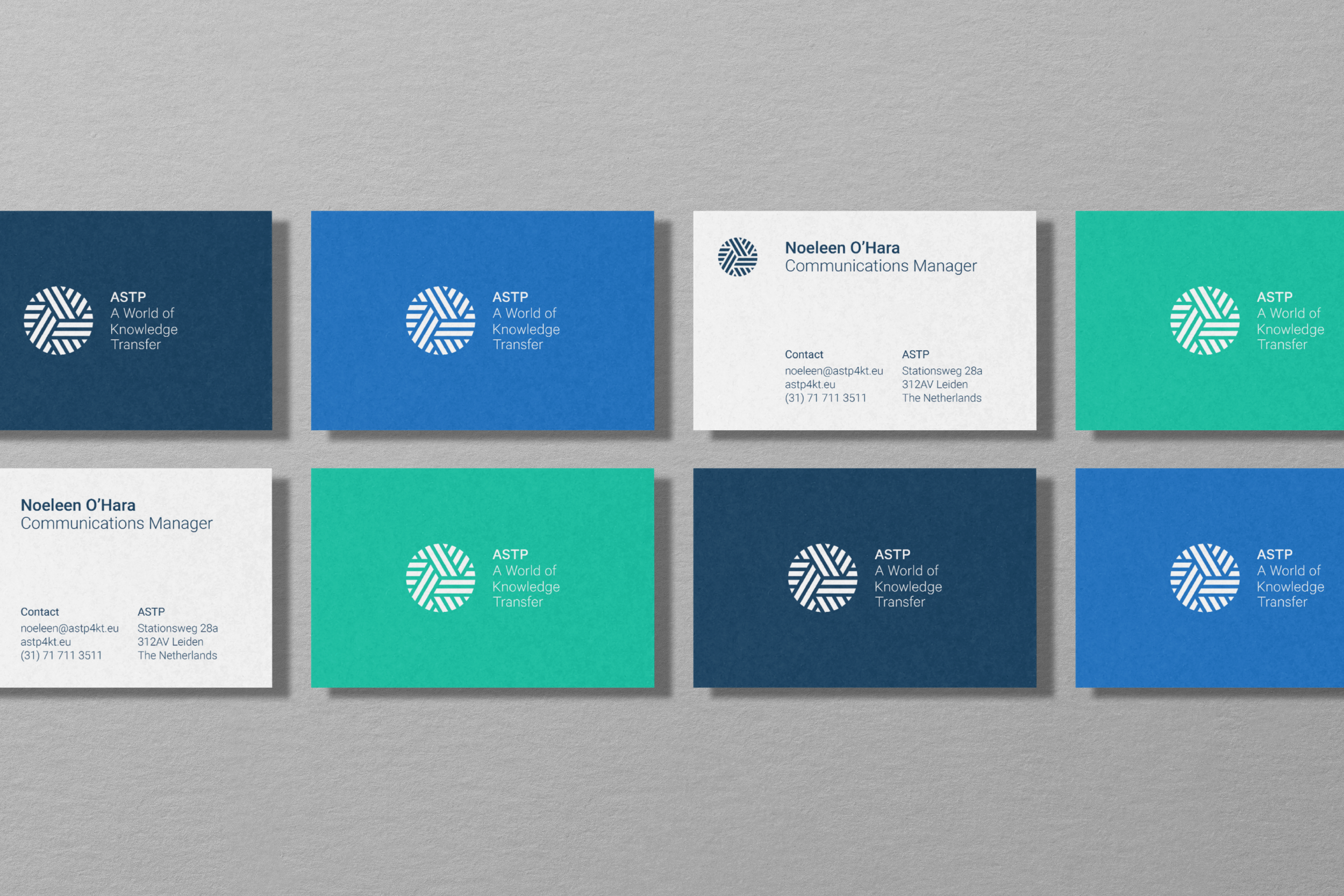
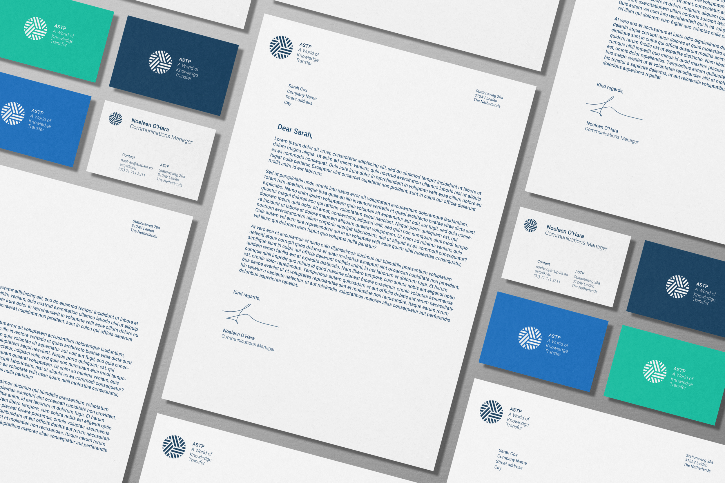
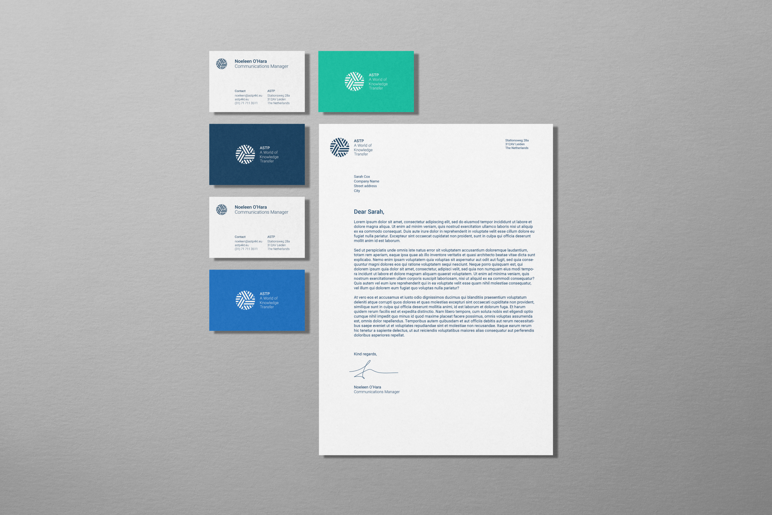
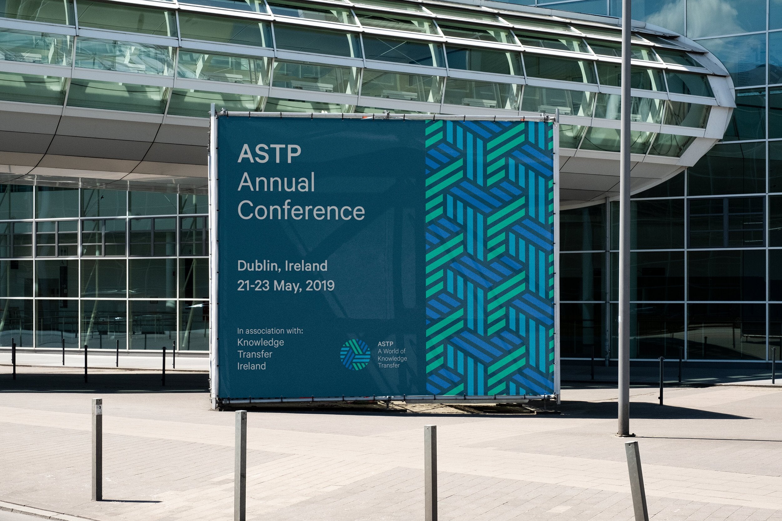
The logo is designed to illustrate the idea of ‘transfer’ with three intersecting metaphoric highways.
The new organisation’s name ‘ASTP’ and mission were given a balanced visual hierarchy, to move the focus towards the organisation’s value and mission.
-
Impact
“The new brand and logo received overwhelming praise from the client’s membership, who complimented the modern look and feel.
BrandCraft delivered materials that grabbed attention while articulating ideas to non-native English speakers without words. Their reliability stood out.”
Noeleen O’Hara
— Communications Manager, ASTP