Naming · Identity · Guidelines · Website
Foxpoint Search
Barker Partners is a recruitment agency based in Hong Kong. Since their launch in 2021, they’ve gone from strength to strength. In 2022 they approached us for the second time, to help strategise and craft a new positioning for their expansion into the Australian market.
Along with the new geography, the leadership team wanted to focus the new venture on technology and fintech recruitment.

-
Approach
The existing company, Barker Partners specializes in traditional financial services, and high-level recruitment.
To set up the office in Sydney, they had two options; either to open the new office under the current Barker Partners branding or to create a sub-brand distinct.
For the new brand, we felt that the new location and service focus presented the company with an opportunity — to create a brand specifically for their new niche.
We helped leadership understand that as the new brand’s positioning was to focus on the fintech and technology sectors, the brands would be known for two industries, and two locations. It made sense to separate the new brand, which could then have more of a modern aesthetic and build local-SEO benefits to its operating area.


-
Solution
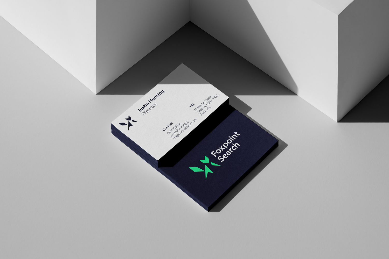
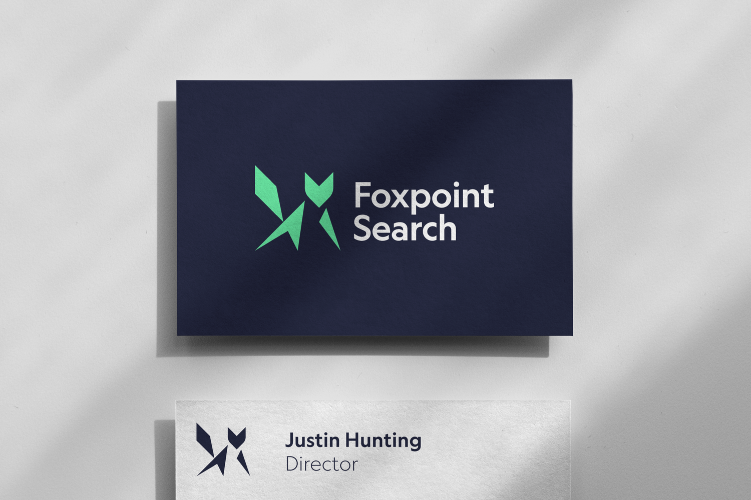
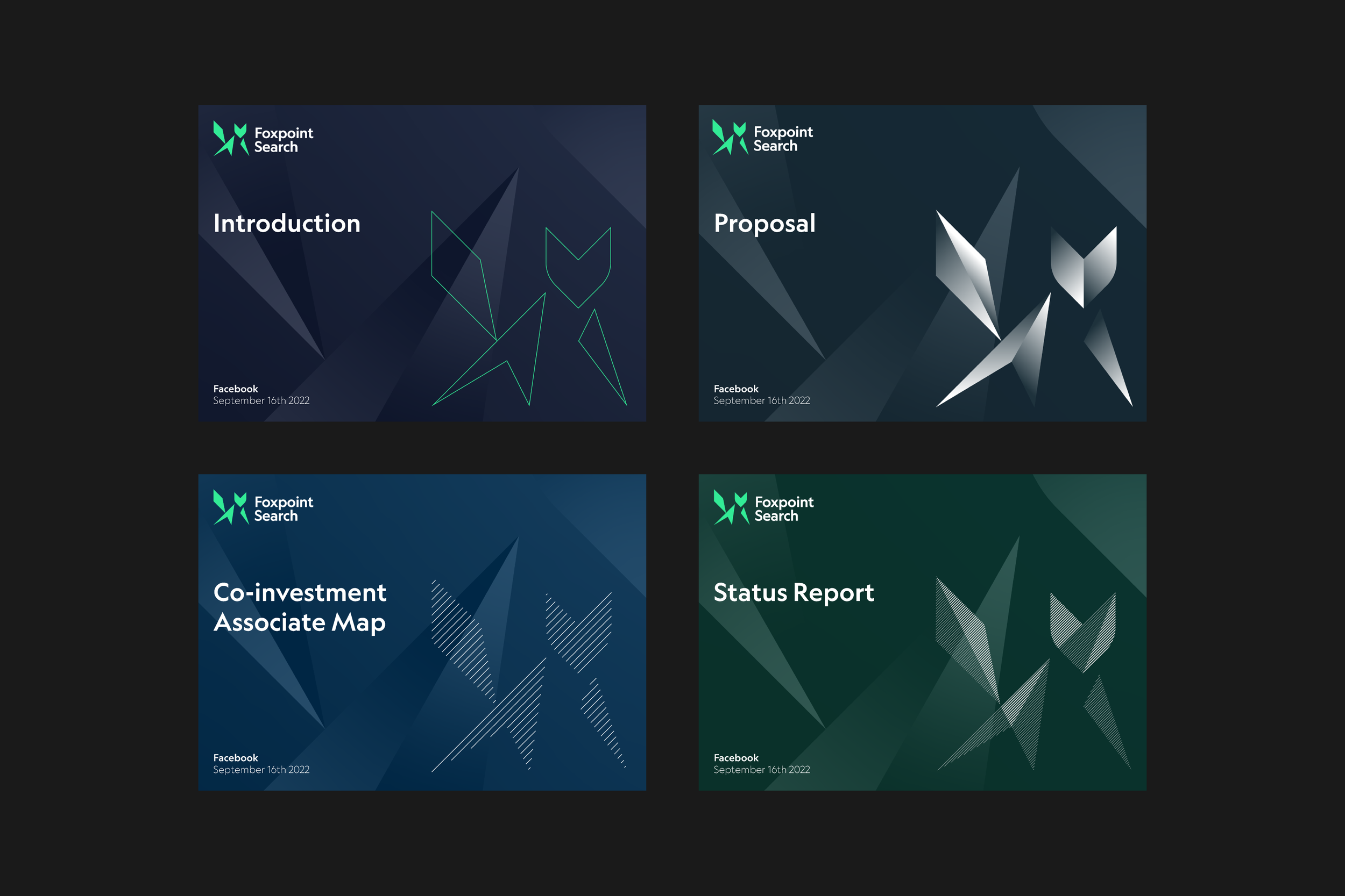
The geometric, angular fox icon along with the bright green subtly illustrates the company’s fintech-focussed recruitment practice.
The fox shape, constructed from a grid, uses the arrow shape to carry the eye upwards and forwards through the logo, communicating Foxpoint’s energy.
-

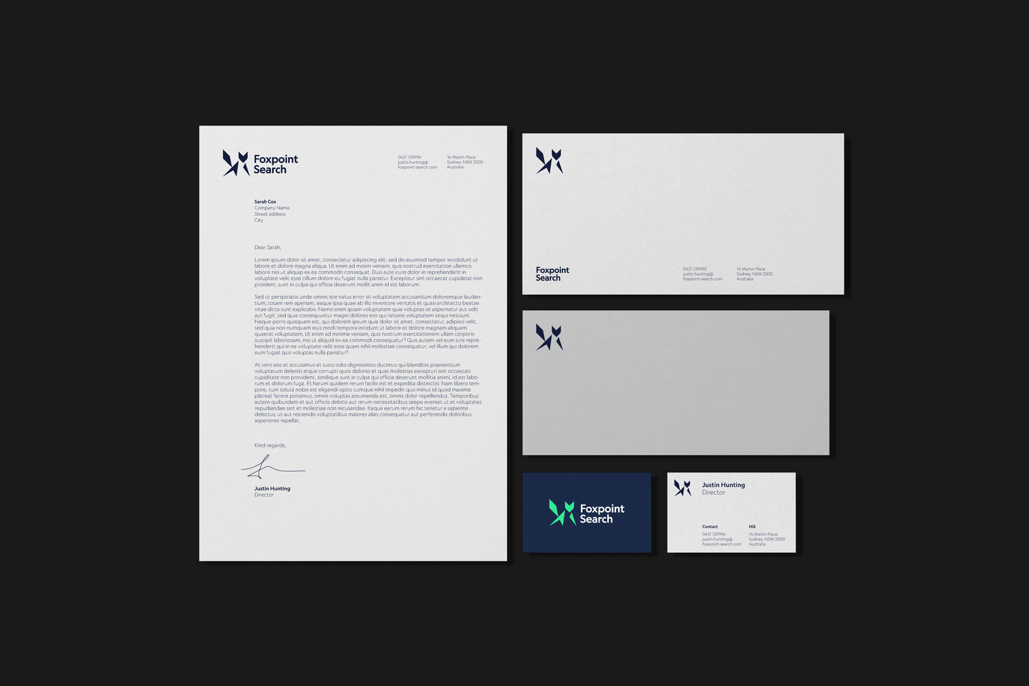
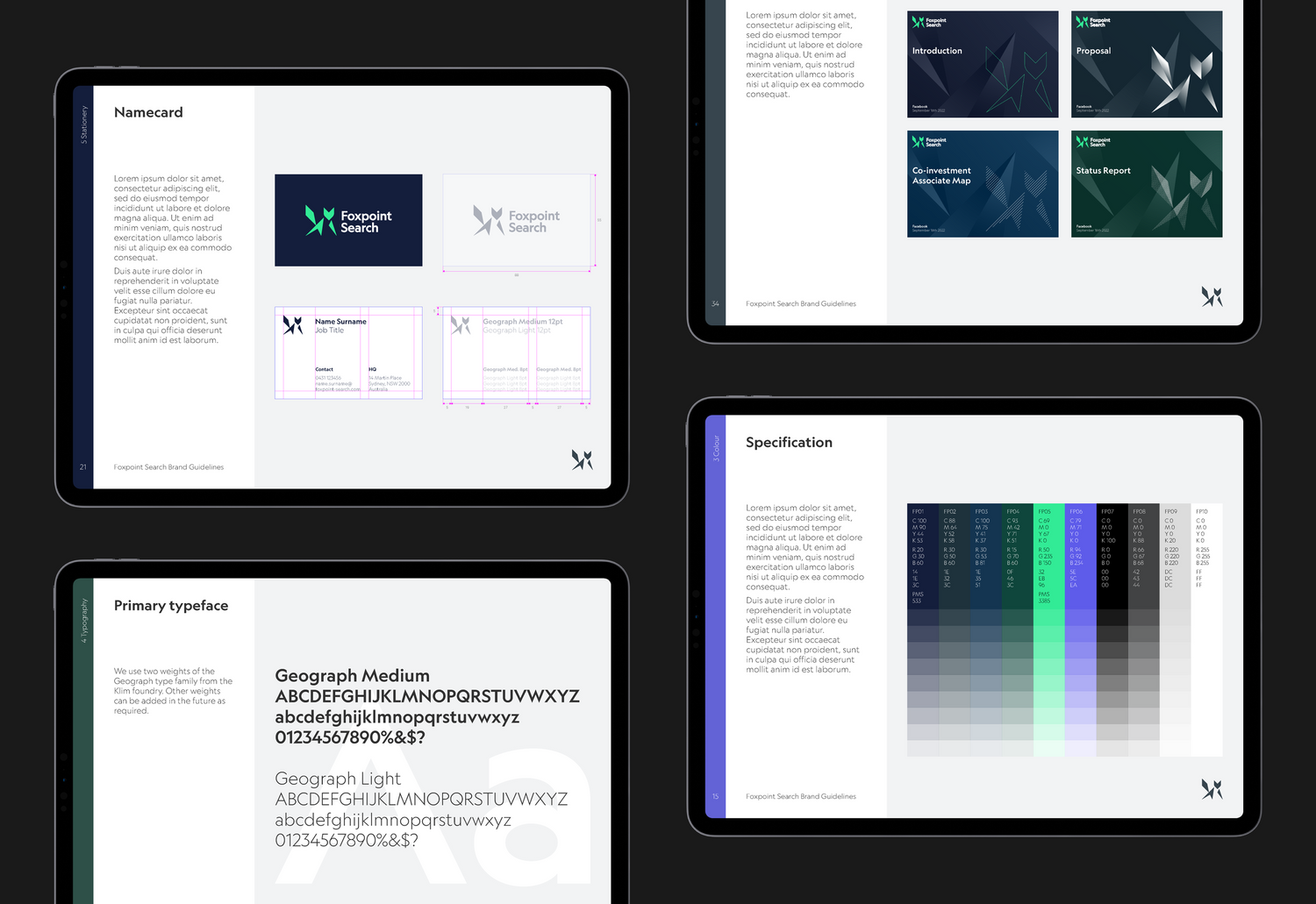
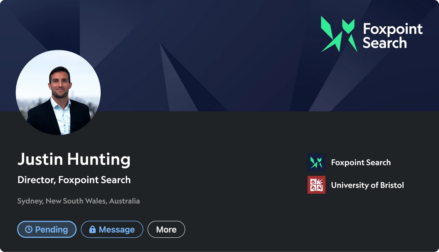
— Master lockup
-

— Brand symbol
-

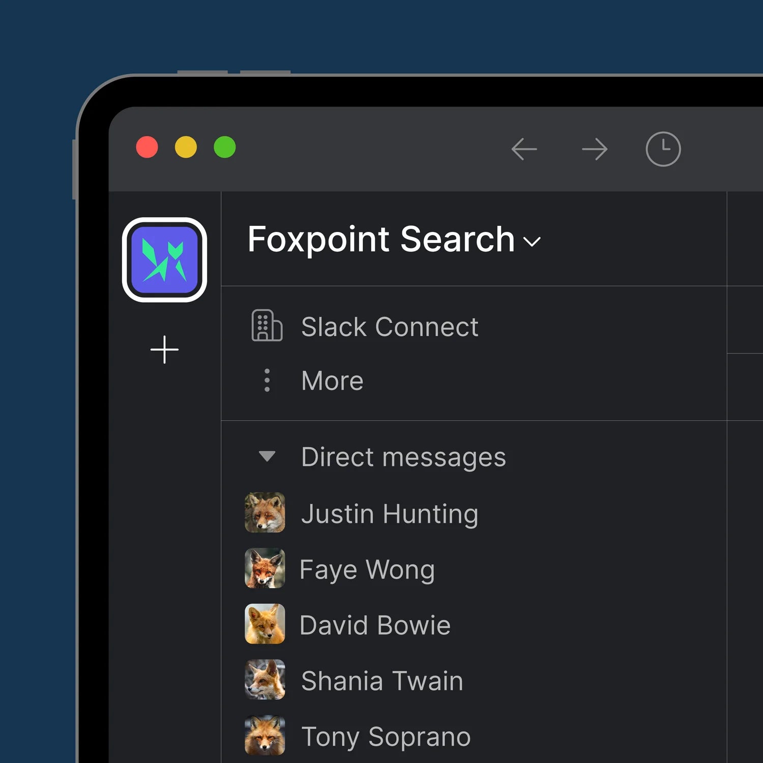
— Recognisable at tiny scale


-

— Data
-

— Cloud
-

— Transformation