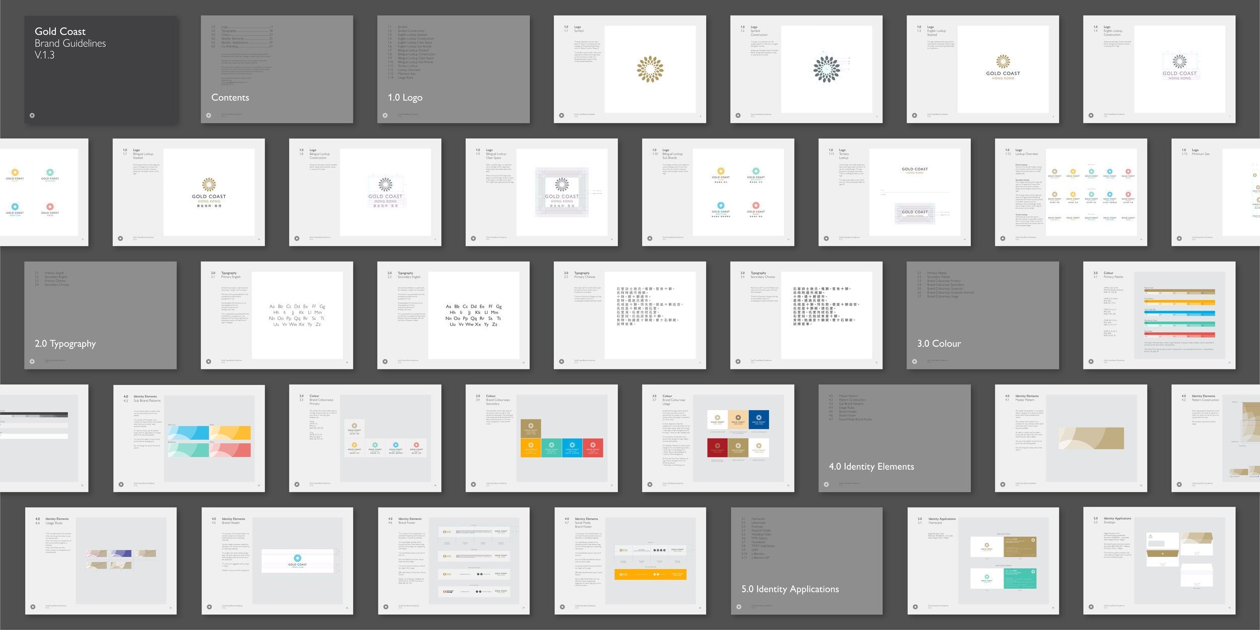
Identity · Guidelines
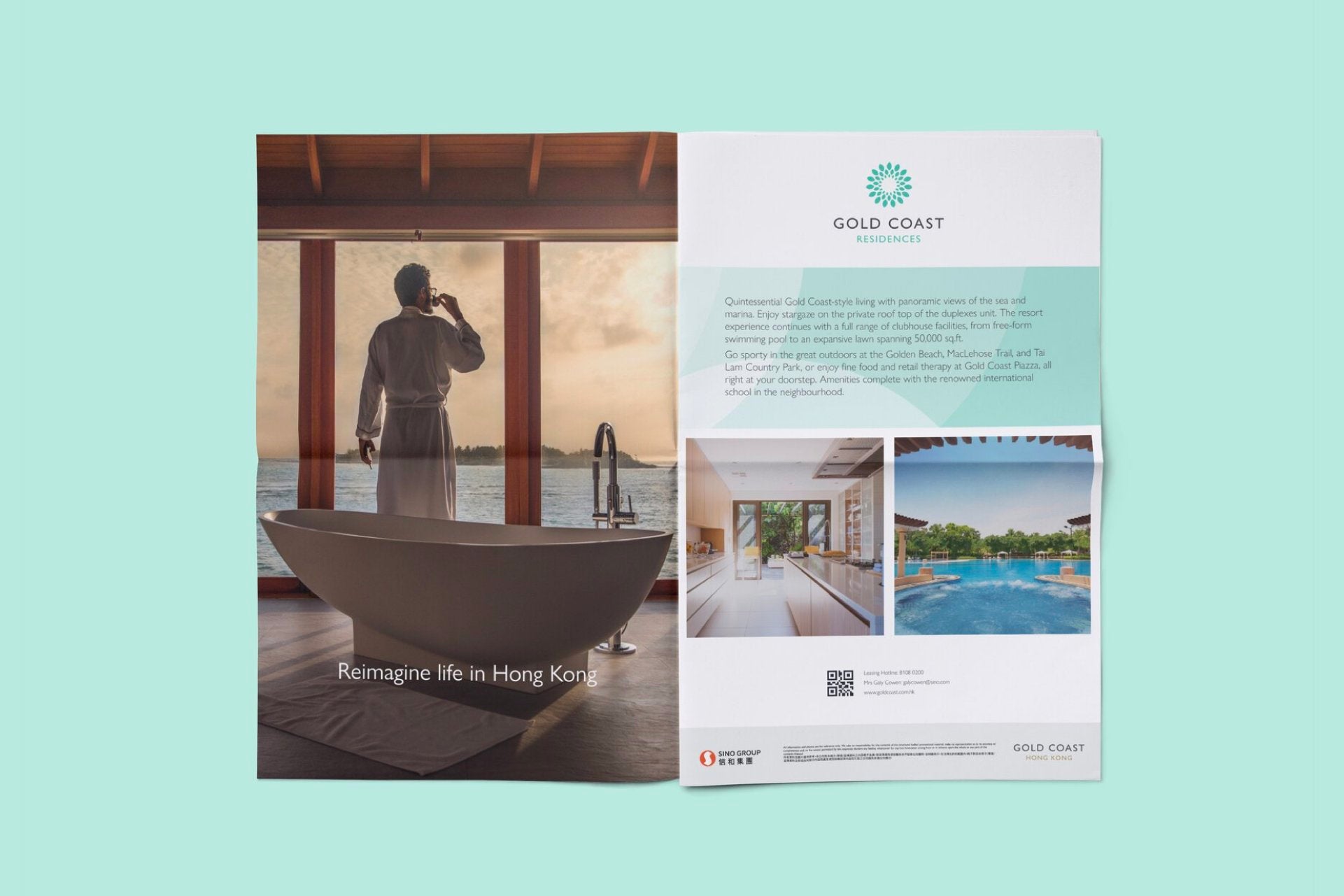
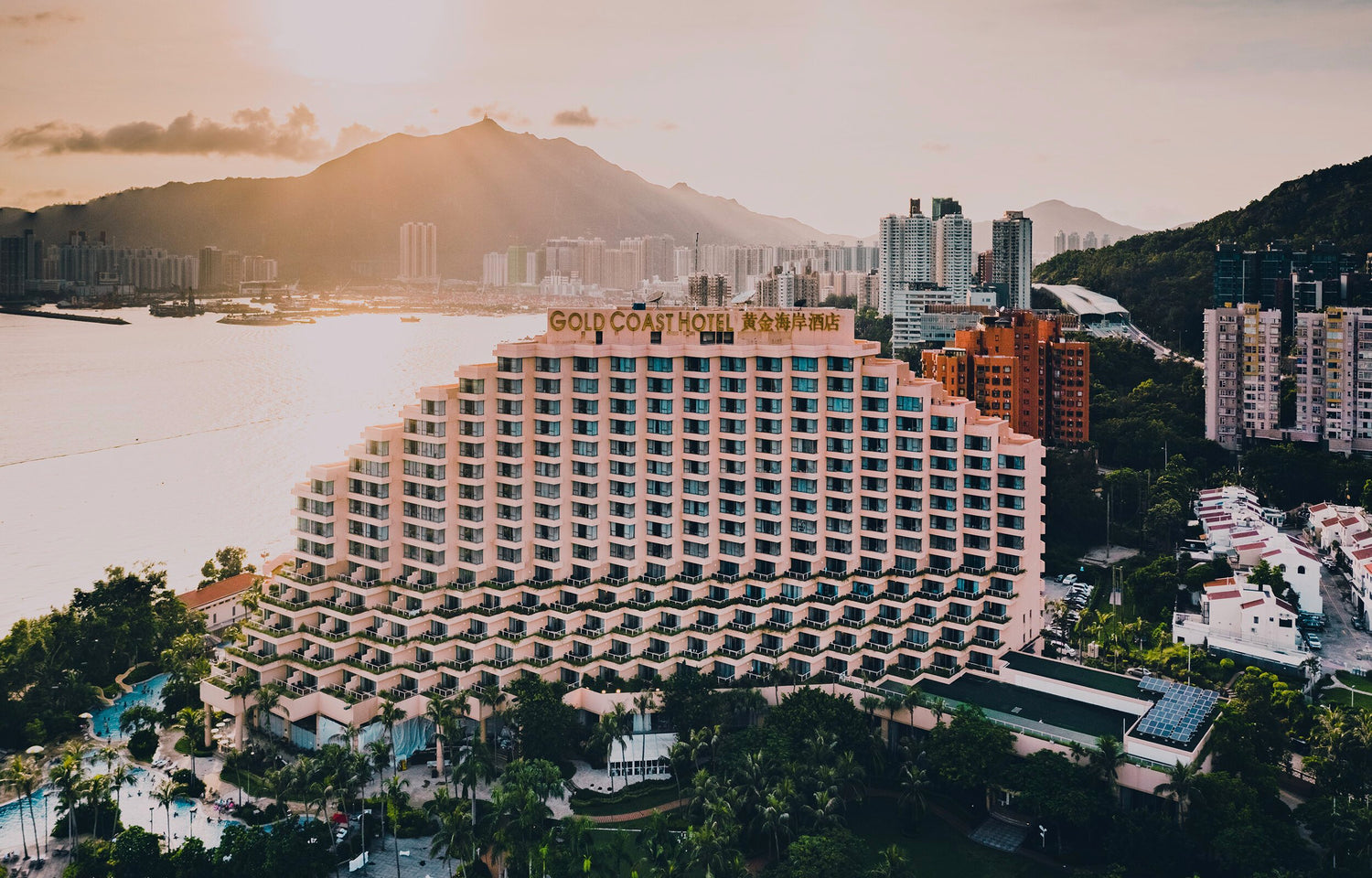
Gold Coast
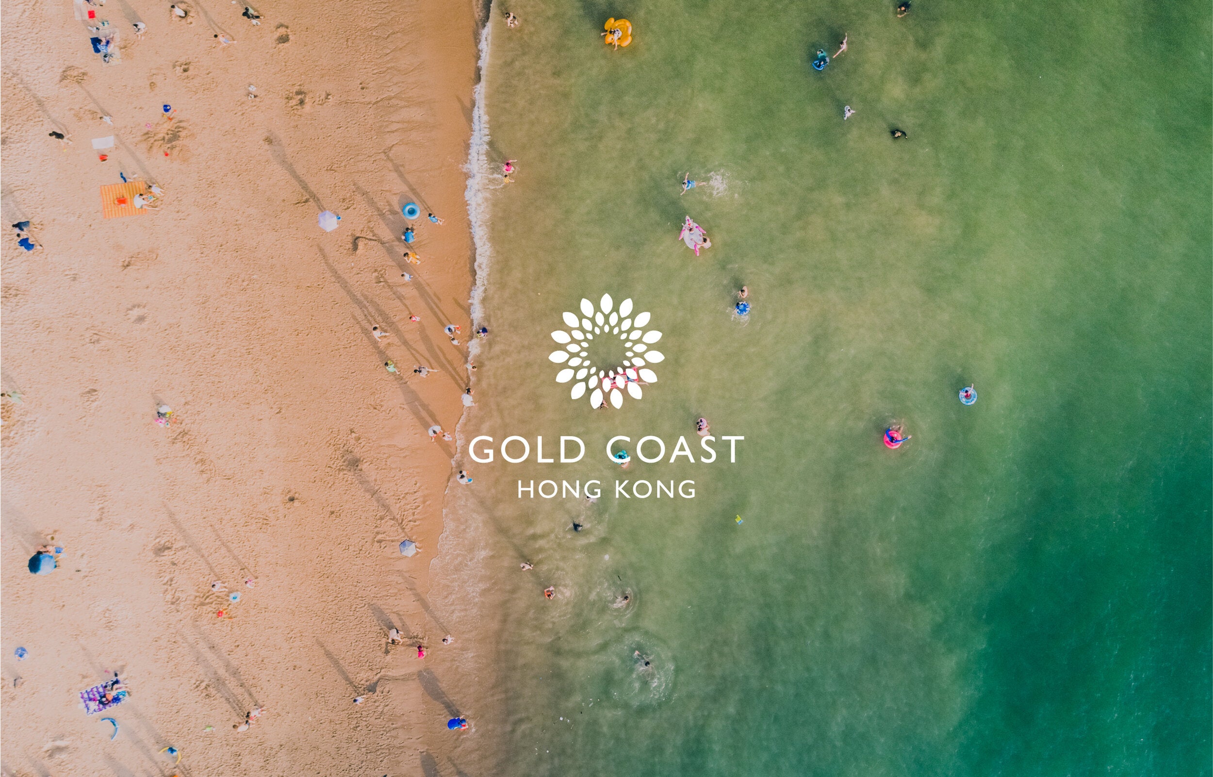
Gold Coast is a coastal resort encompassing exclusive residences, hotel, yacht club and outdoor piazza shopping and dining area. BrandCraft was tasked with redefining it as a modern paradise away from the hustle of the city.
The existing Gold Coast identity was introduced when Gold Coast Hong Kong was built in 1993. After 25 years, the identity had become outdated and no longer expressed their high-end market positioning.
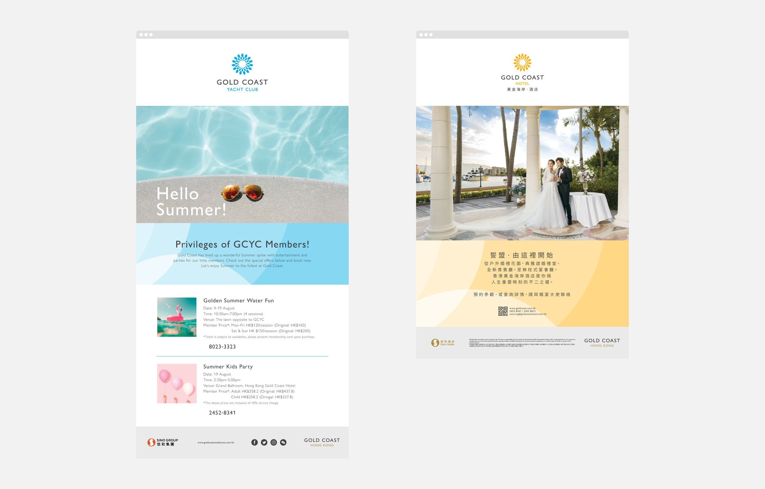
The branding consisted of a variety of disconnected sub-brands without a singular, ownable master logo.
-
Approach
We worked with key stakeholders to unravel what Gold Coast stands for in the mind of their consumers, to be defined once again as one of Hong Kong’s most desirable destinations for living, entertainment and breaks from the city.
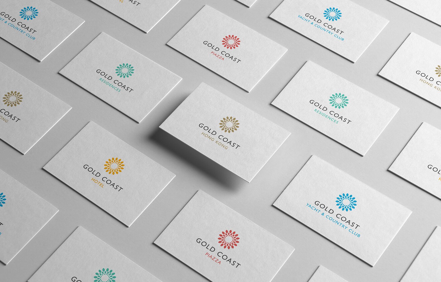
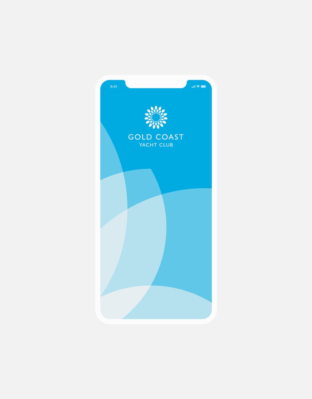
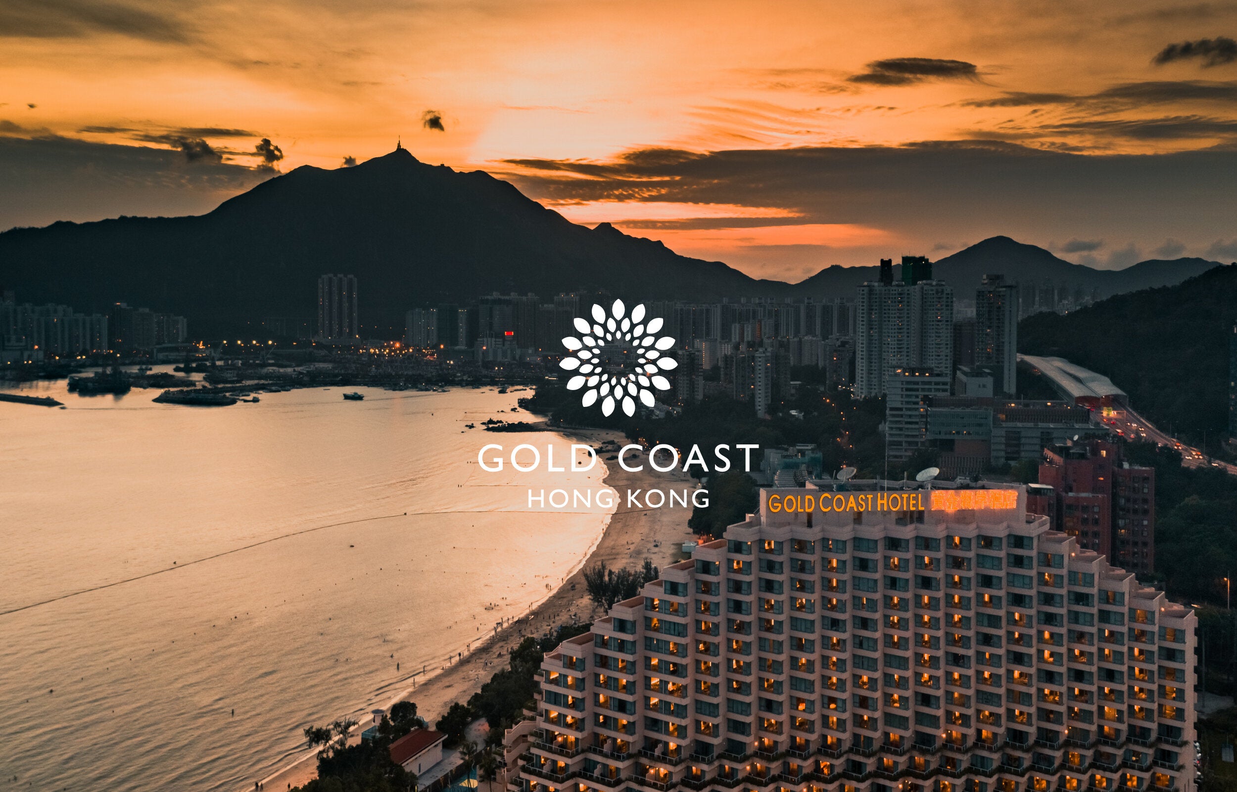
We looked at Gold Coast’s surroundings and focussed our moodboards on imagery of sunsets and flowers in bloom. These images evolved into a youthful colour palette which was then applied across the group’s sub-brands.
-
Solution
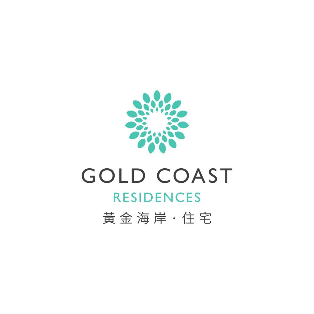
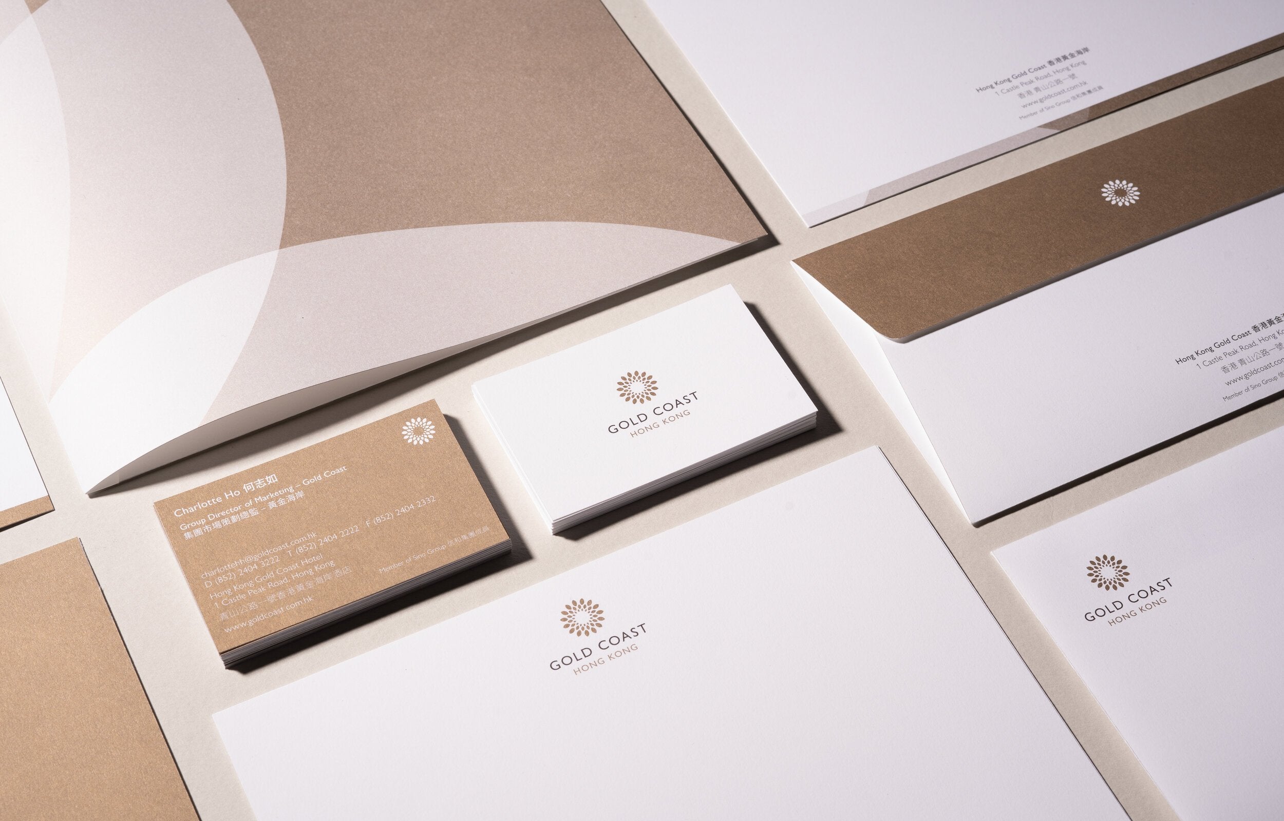
The refreshed visual identity is designed to translate imagery of nature and the sunsets that residences and visitors to Gold Coast experience.
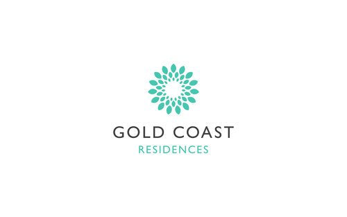
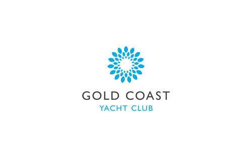
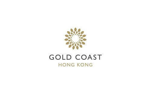
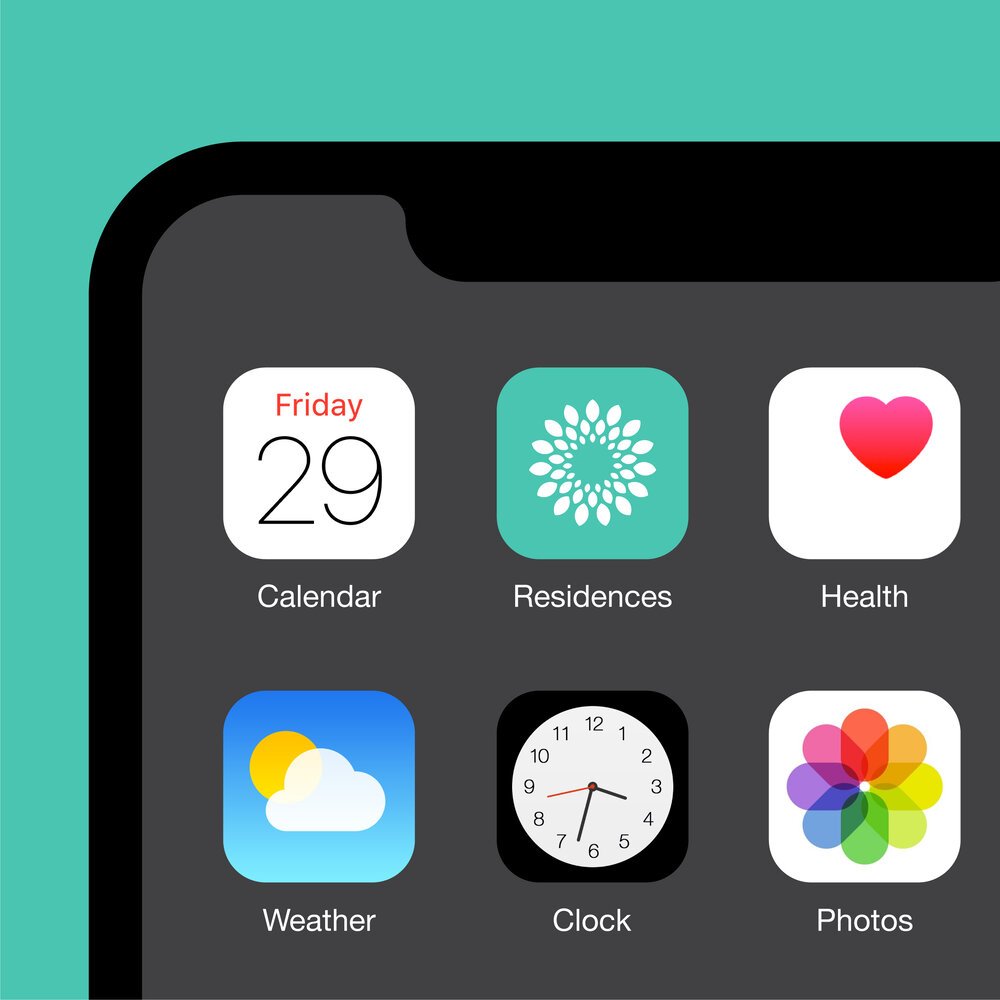
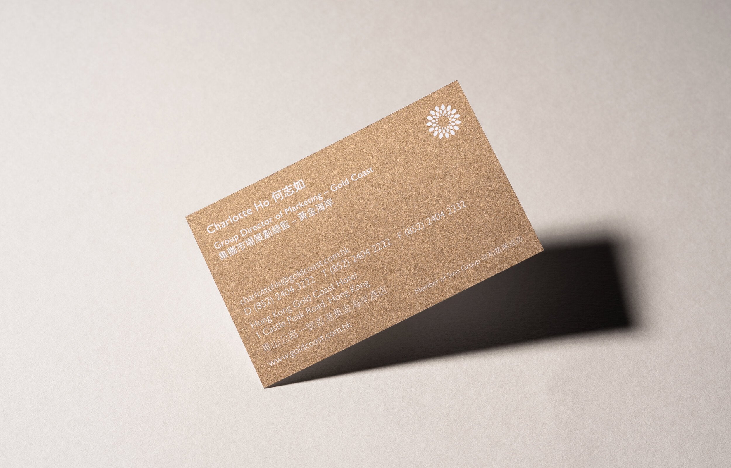
The identity uses a singular brand mark and a simple and functional stacked logotype that can be used across each of the Gold Coast brands; Residences, Yacht Club, Piazza and Hotel.