
The visual identity process involves four key stages:
— Ideation
— Visualisation
— Presentation & revision
— Handover
Following the brand strategy phase where we built-out and digested our design brief, we can now put pencil-to-paper.
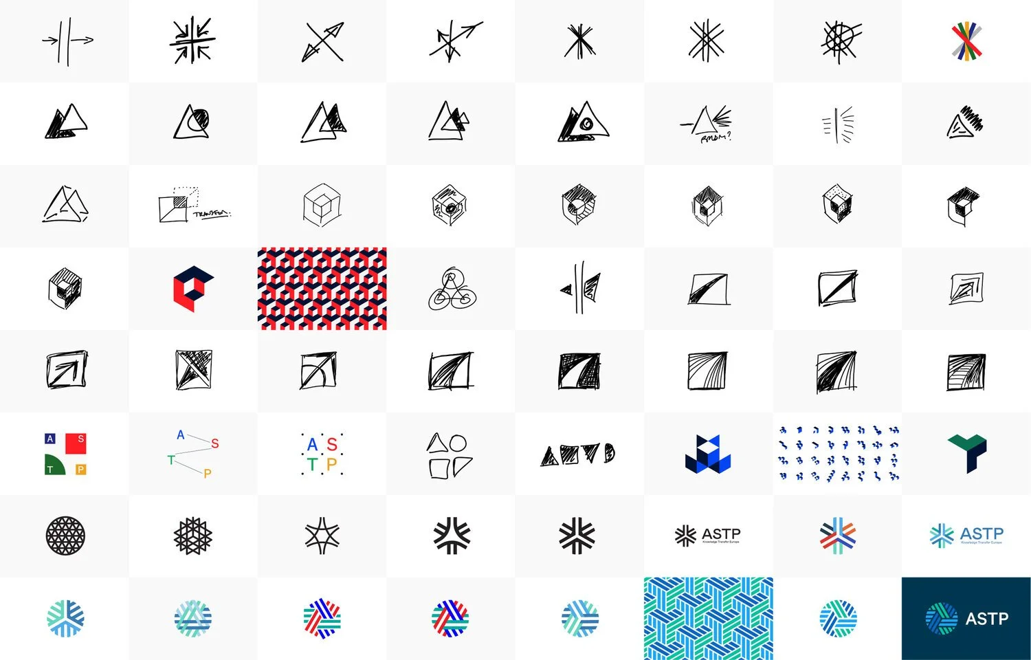
Ideation
We begin with these basic materials as it is the most basic form of mark-making. To begin directly on mac and tablet limits creativity.
Logo or logotype?
— There are different kinds of logo lockups. We start with the logo form itself.
Logo design theory
— There are three key things we focus on when designing a logo.
1. A logo must be memorable
— A study on the memorability by signs.com, 150 people were asked to draw ten logos from memory. Illustrated in the study, the most memorable logos are made from the simplest forms. Ikea, Target and Apple came out on top, all three have very simple forms.
2. A logo must be functional
— This sounds obvious, but so often overlooked. A logo has to be functional to work at different sizes and in different circumstances. Print/ web/ app/ within a square.
3. A logo must be contextual— The logo should be contextual to the company. It should feel appropriate and not visually awkward or at odds to it’s application.
Branding development overview
Visualisation
The deliverable of this phase is three distinct visual identity concepts. For each direction, we present contextual moodboards to introduce each concept, followed by three fully fleshed out brand identity concepts including logos; logotype wordmark; lockup options; brand assets; typography and colour palette.
To visualise and illustrate the functionality of each brand identity direction, we present mockups across appropriate deliverables such as stationery, signage, social media profiles etc.
To reach three distinct branding directions. We present each concept through a journey, introducing it through two moodboards, a visual reference moodboard, followed by a graphic language moodboard.
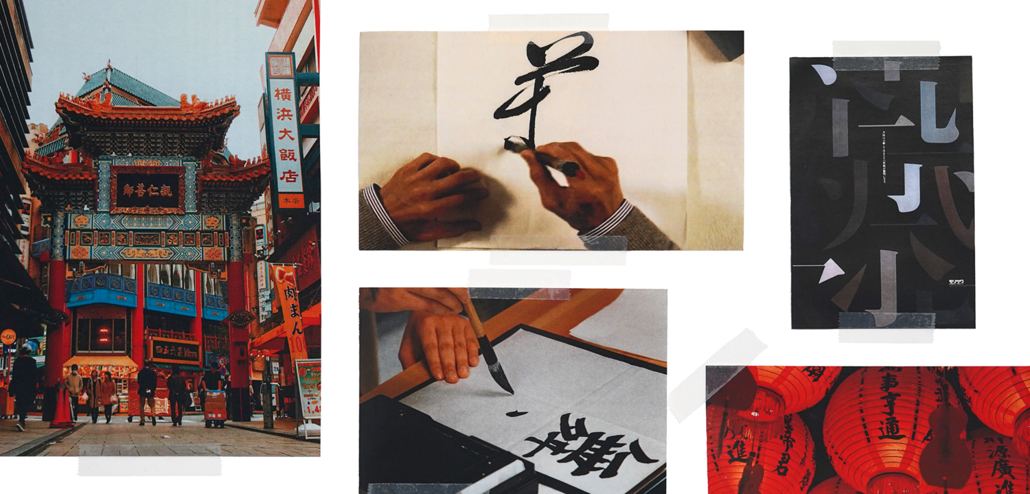
Visual reference moodboard
Presentation & revision
Visual reference
— Visual reference moodboard sets the scene to introduce the branding concept. It is the first time the strategy will be translated into something visual. The moodboard creates a foundation of visual context, a curated series of reference images. The visual reference does not yet touch on graphic style, or other brands, rather focusses on mood-setting, with abstract imagery, fables or stories.
Graphic language
— Graphic language looks more critically at the aesthetic graphic style of the concept, again helping to contextualise the concept through typographic and form reference and colour palettes.
Concept
— The branding concept is presented once the moodboards are presented, discussed and digested. It is important not to rush to show the identity without translating a foundation of context, both in metaphor and aesthetic. The concept is presented, mocked up on branded collateral that is appropriate to the business.
Revision— Once a branding concept is chosen we work with our clients through three stages of critique and revision.
Handover
File delivery— After the final revision stage, we will handover logo source files, print and digital-ready files, including RGB, 4C and Pantone. The delivery commonly includes deliverables such as print-ready namecard and stationery templates, websites and packaging artwork.

Screen grab from an extensive project delivery of over 500 different logo files. Including multiple kinds of brand lockups, sub-brand lockups and file types for each.
Brand guidelines
After applications are discussed, these will be turned into a brand guideline.
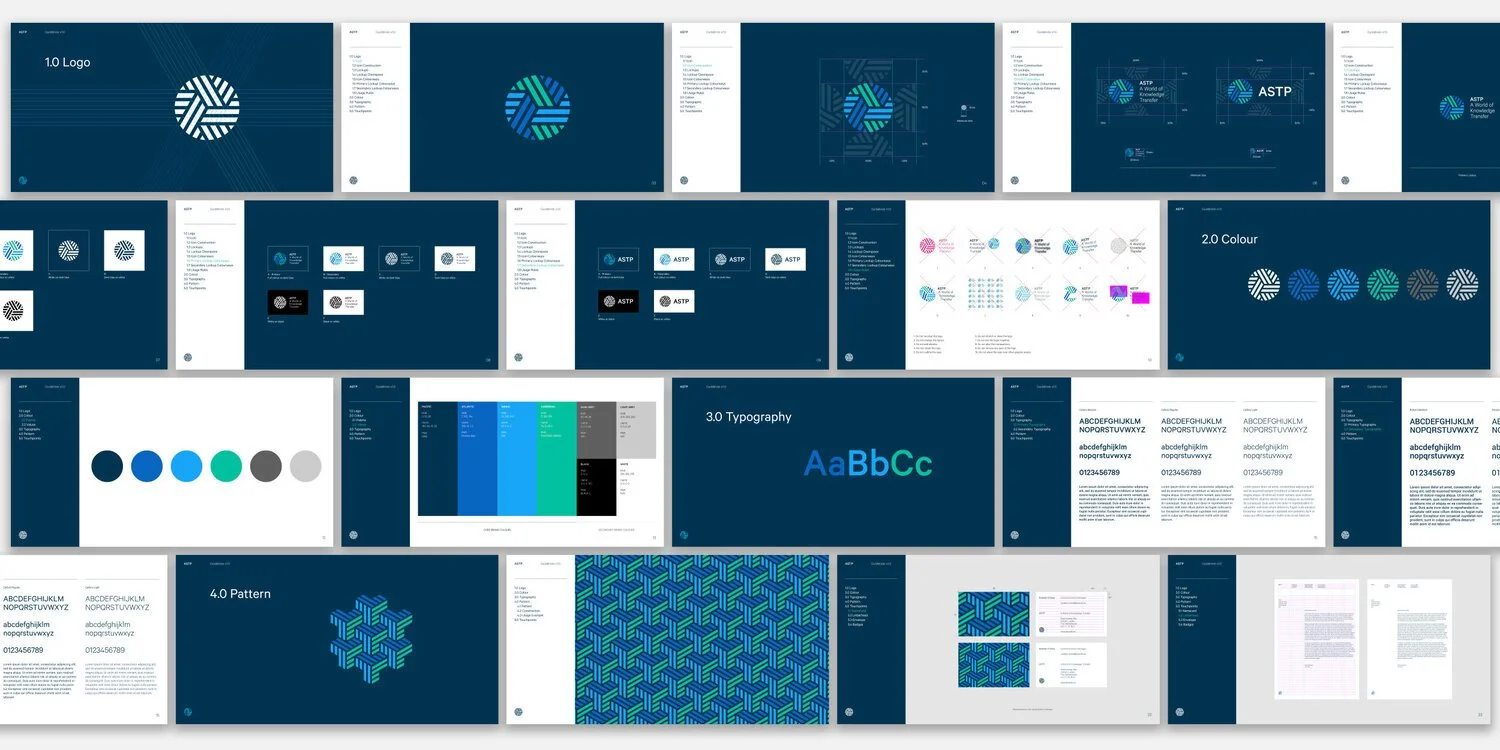
Brand guidelines
-
More Posts in Brand Toolkit
Week 1 – Overview
Week 2 – Brand Strategy
Week 3 – Visual Identity
Week 4 – Brand Launch